Hotwire Mobile Search
Apps & mWeb – Sr Product Designer – 2019
Apps & mWeb – Sr Product Designer – 2019
Mobile is quickly becoming the place where the majority of Hotwire transactions occur. As of July 2018, mobile traffic comprised nearly 50% of our total traffic. As such, we needed to evolve our mweb experience to be more mobile friendly and ultimately mobile first.
One of the Acquisition team’s main initiatives is to increase search rates. Yet our mobile search experience was merely a scaled-down version of the desktop search experience. I took it upon myself to state a case for redesigning the experience of searching Hotwire using mobile devices.
A streamlined, more mobile-friendly search experience will reduce friction and make it easier and faster to perform a search on mobile screens. This will reduce bounce rate and increase search rate.
One of my first steps in optimizing our mobile search experience was to analyze our user’s current search behavior. This allows us to prioritize the options based on our user’s needs.

What’s currently working and not working in our mobile search experience? What pain points have been encountered and documented? A deep dive into each micro interaction brought greater focus on areas of improvement.
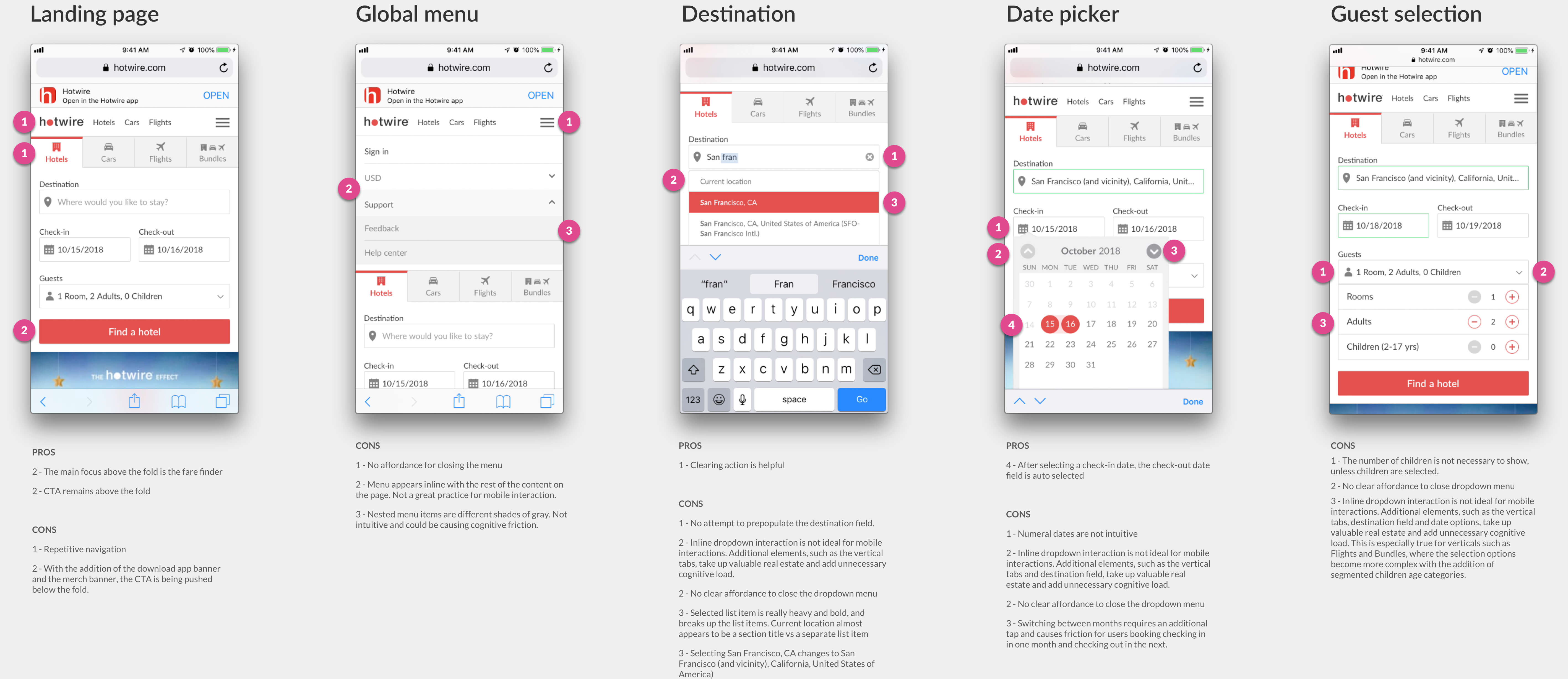
Tracking each tap and interaction allowed me to analyze how many interactions were required before returning results.

What are our competitors doing better than us? Are there emerging industry standards in the way users expect to search for travel bookings online? Taking a deep dive into the competitive landscape surfaced many areas of improvement.
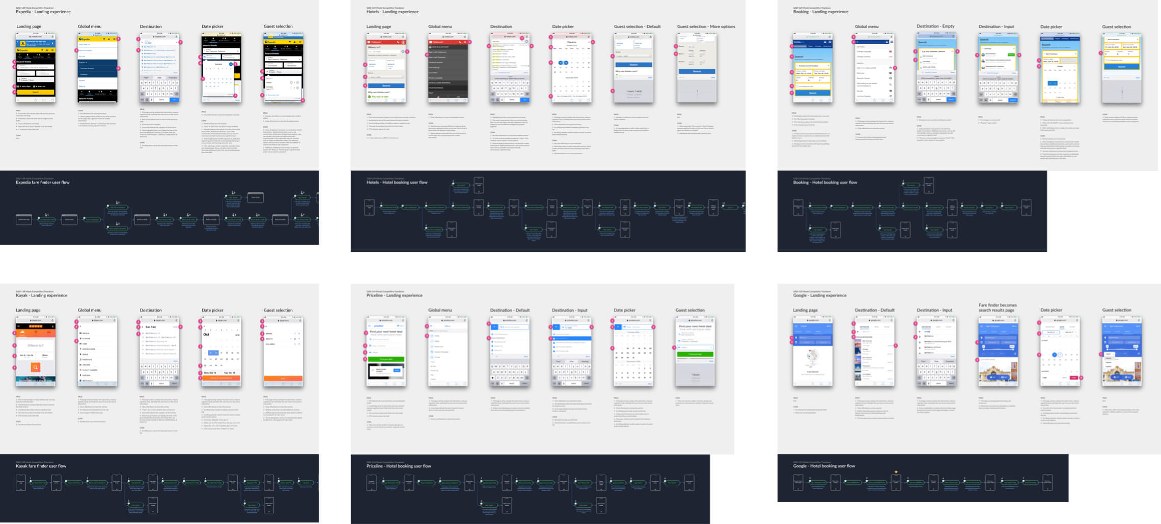
Based on the Hotwire and competitive landscape teardowns, as well as areas of friction that have been reported through our online feedback and customer support, I compiled a list of areas in which Hotwire could improve their mobile search experience.
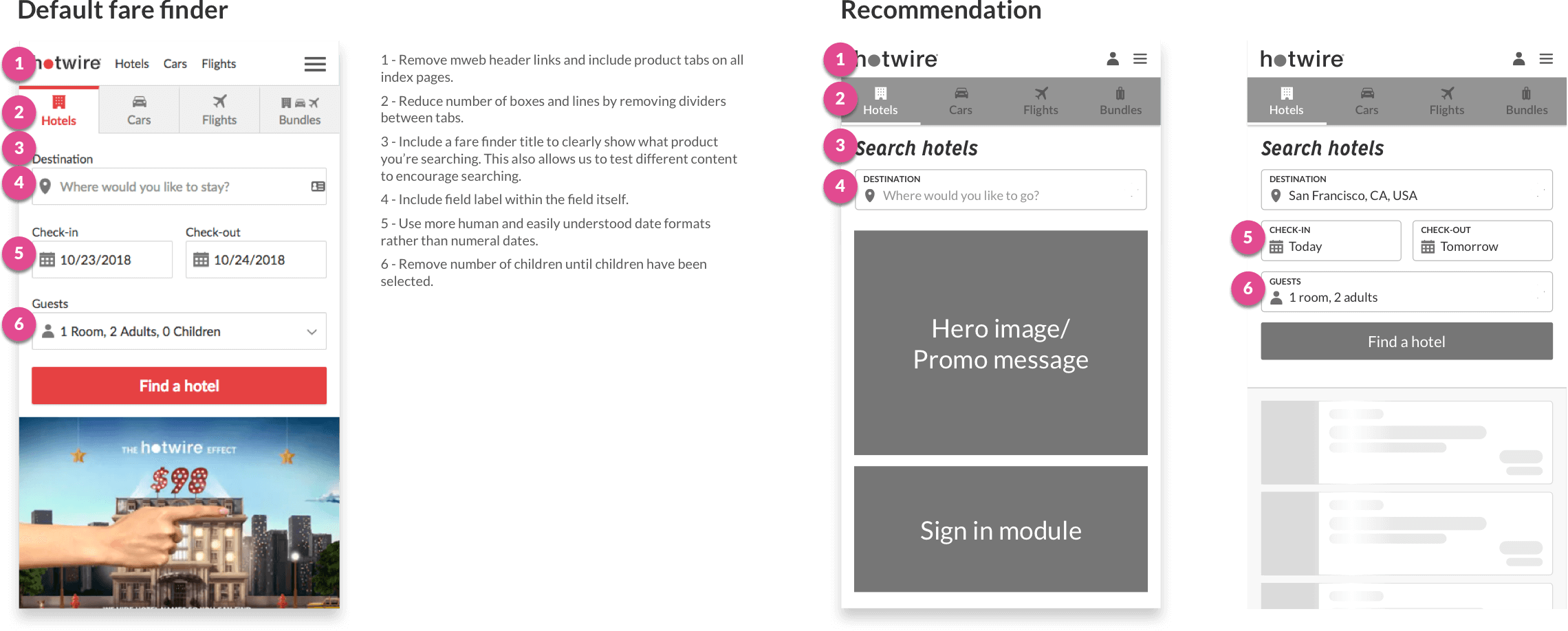
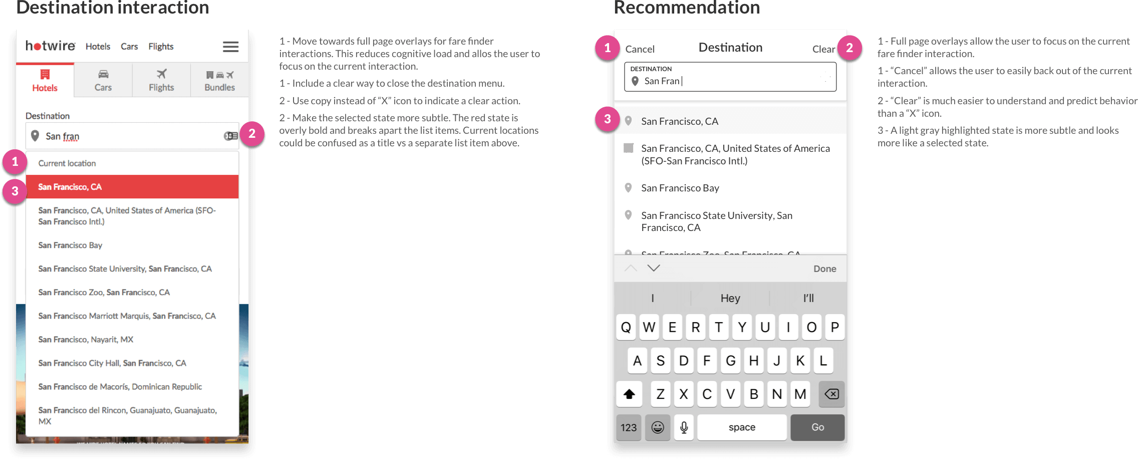
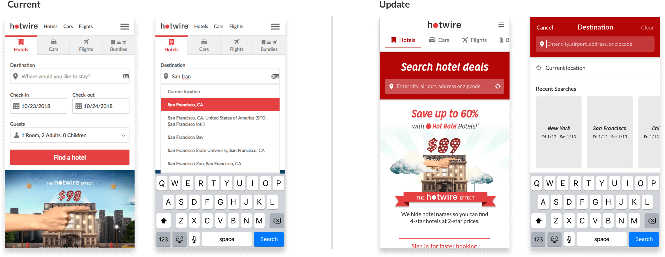
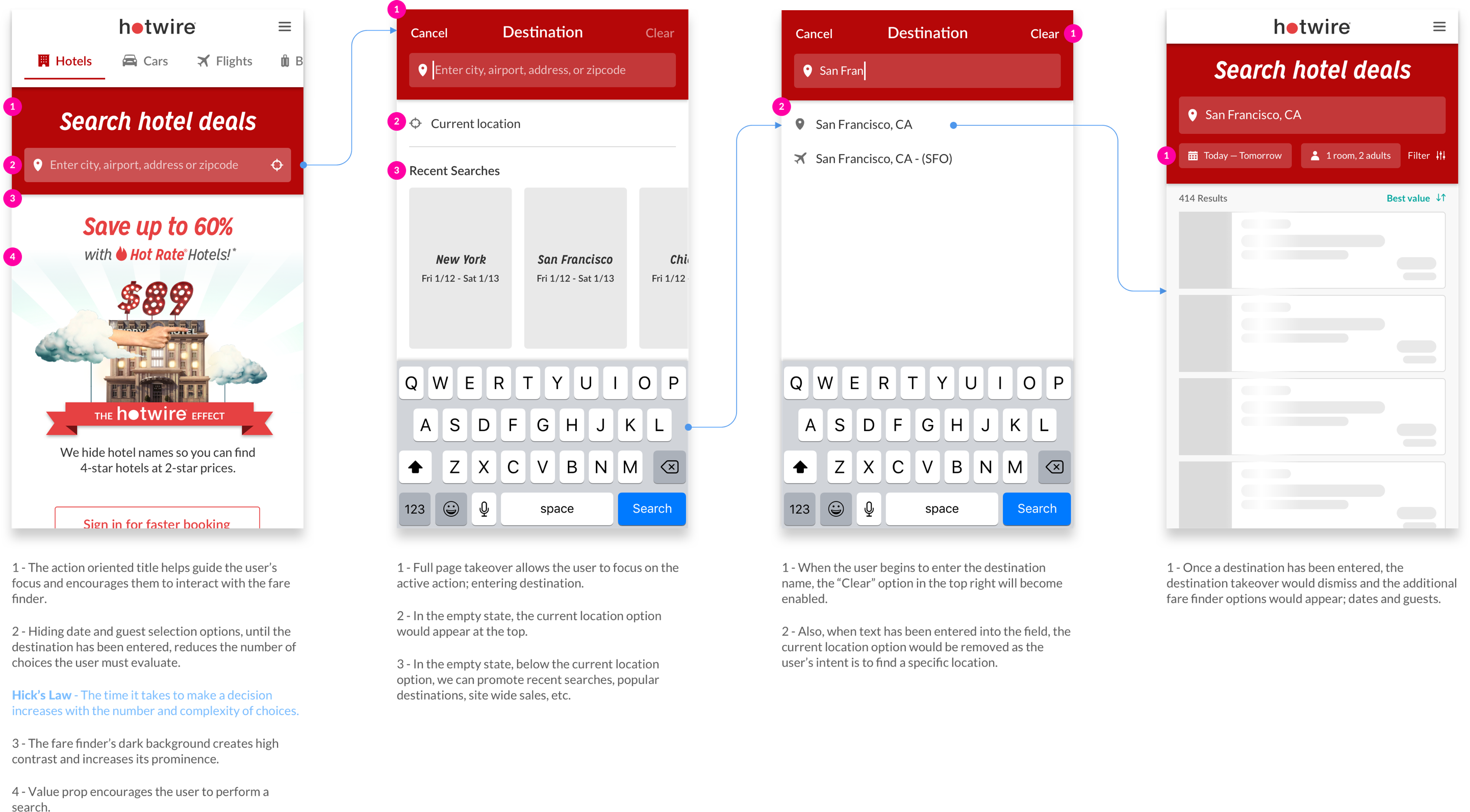
65% of our mobile users only enter a destination and do not modify dates or guests. By returning results after a user enters a destination we reduce the number of taps required to enter the conversion funnel.

Hick’s Law states that the more choices a person is presented with, the longer the person will take to reach a decision. Since 65% of our users are only interacting with the destination field, let’s remove options and visual clutter and focus the user attention on entering a destination.
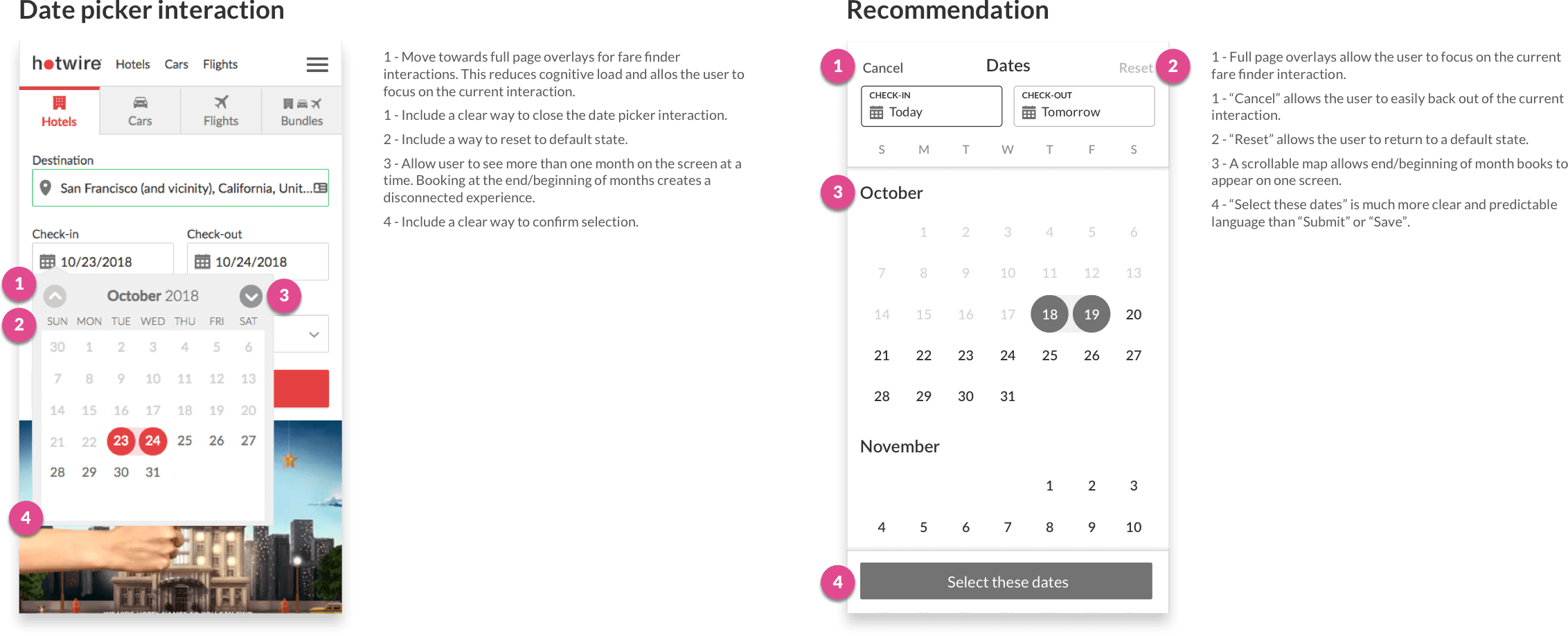
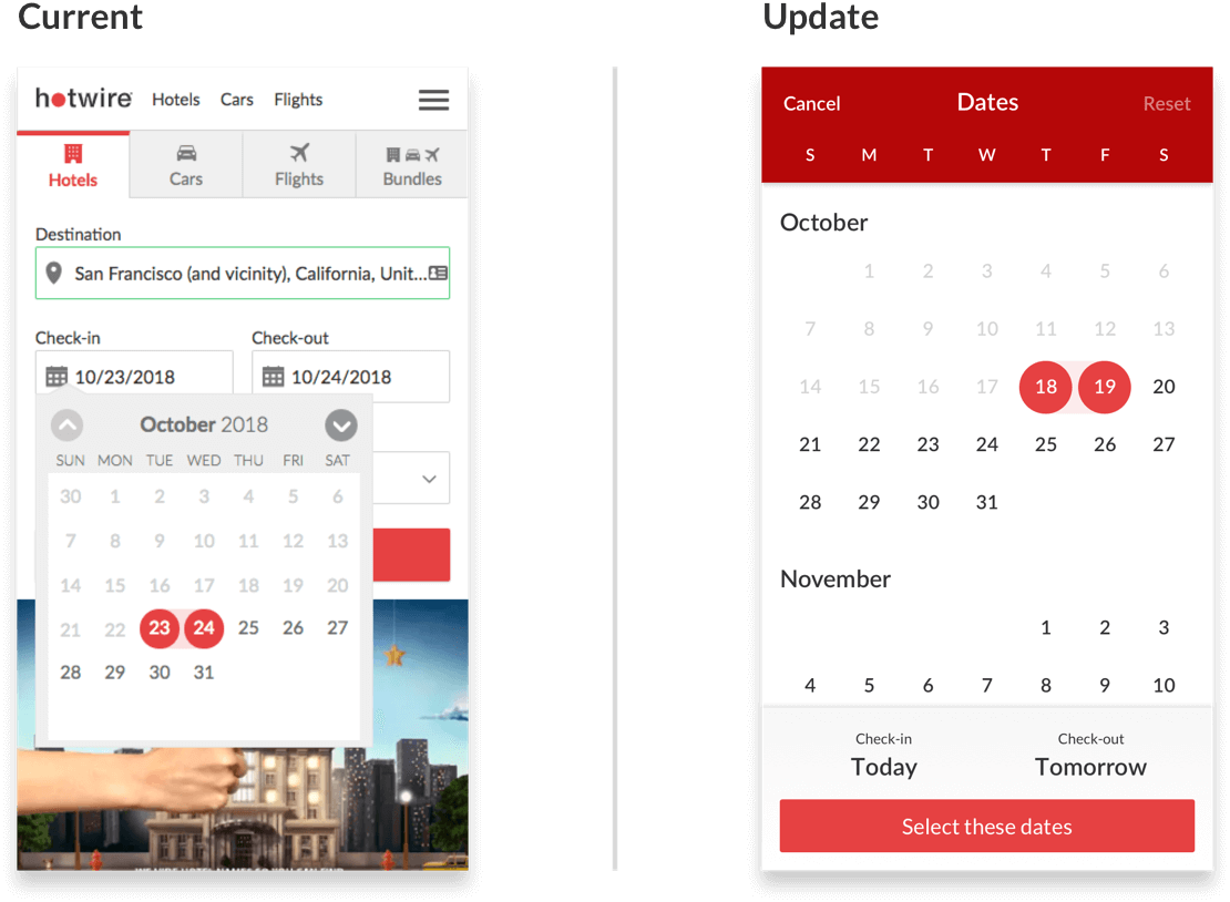
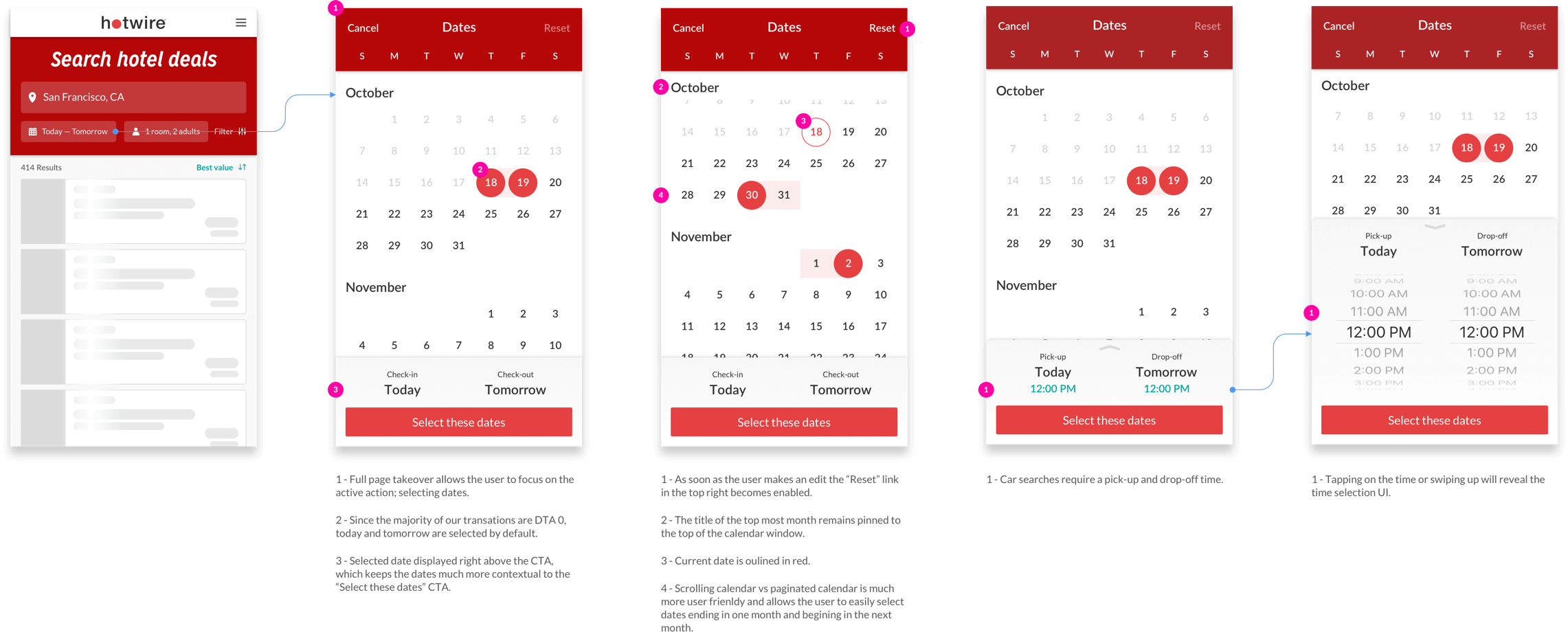
We’ve observed many instances of users encountering friction when trying to input dates via their mobile devices. The paginated month engagement was adding unnecessary taps to the interaction and confusion as the user could not see both the check-in and check-out dates on one screen when booking at the end of the month.
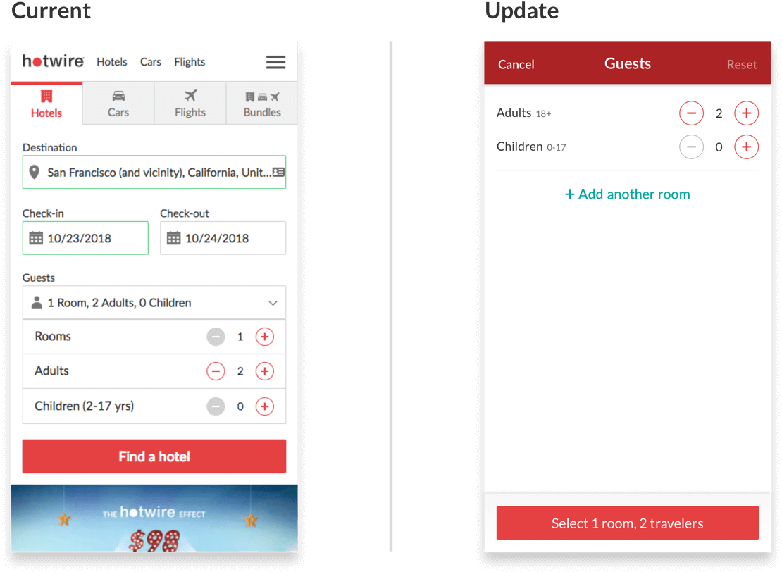
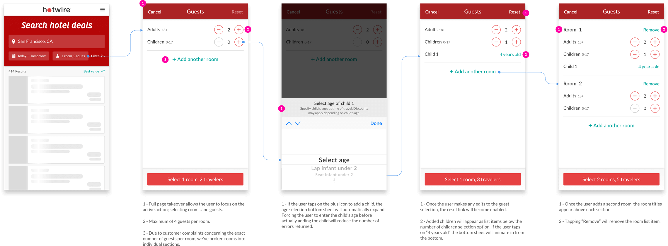
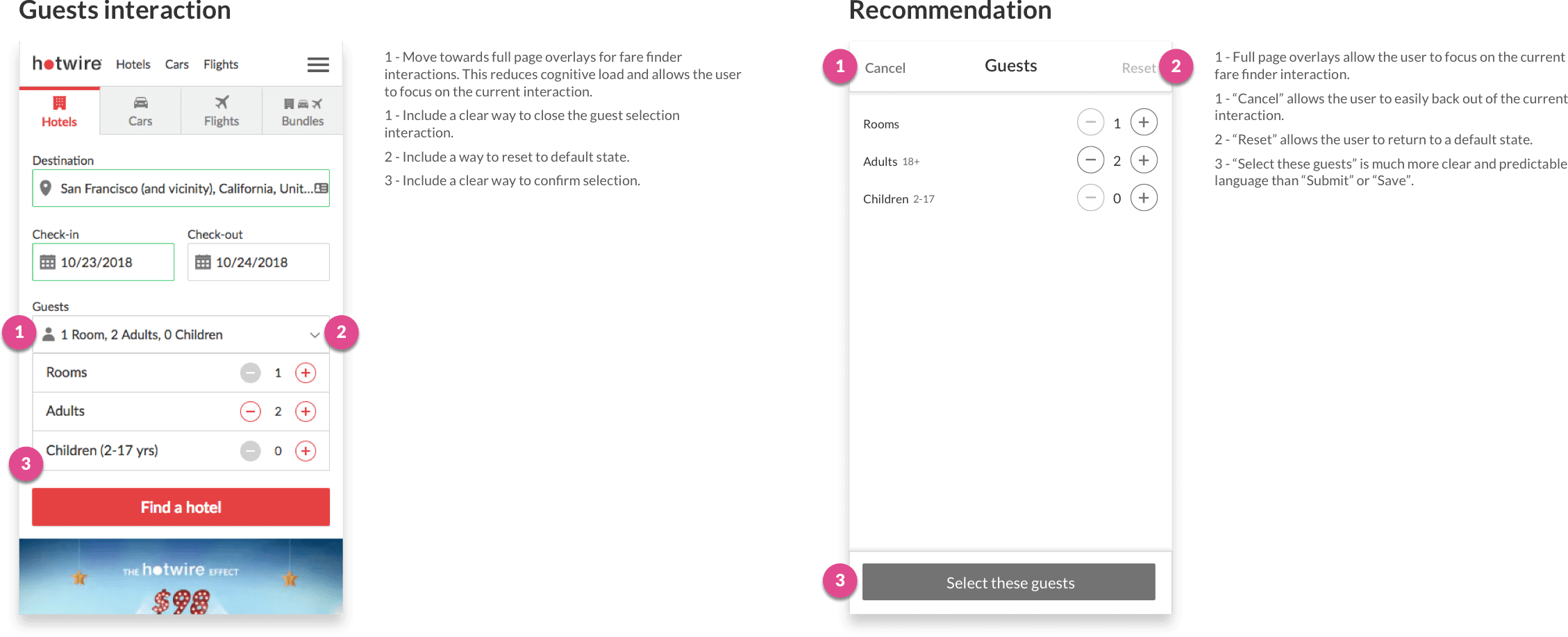
Based on usability tests and user feedback, the guest selection interaction was not as intuitive as one would think. Some users were under the impression that selecting 2 rooms and 2 guests meant they were booking 2 rooms with 2 guests in each room, when in fact they were booking 2 rooms with 1 guest in each room. This resulted in extra-person fees at the time of check-in.
