Hotwire Modal Standards
Design System & Ops – Sr Product Designer – 2019
Design System & Ops – Sr Product Designer – 2019
A lack of guidelines around our modal messaging standards was causing designers to have to reinvent design and interaction patterns each time they needed to use a modal. This resulted in several different modal treatments scattered throughout the product, as well as additional time spent by our development team building modals from scratch each time.
Componentized and clearly defined modal standards will allow designers to work faster by eliminating the guesswork involved in deciding when to use each type of modal design pattern. Standardized design patterns also allow our Dev team to componentize the code in order to be shared with other development teams.
A modal window is a graphical control element subordinate to an application’s main window. It creates a mode that disables the main window but keeps it visible, with the modal window as a child window in front of it. Users must interact with the modal window before they can return to the parent application. This avoids interrupting the workflow on the main window.
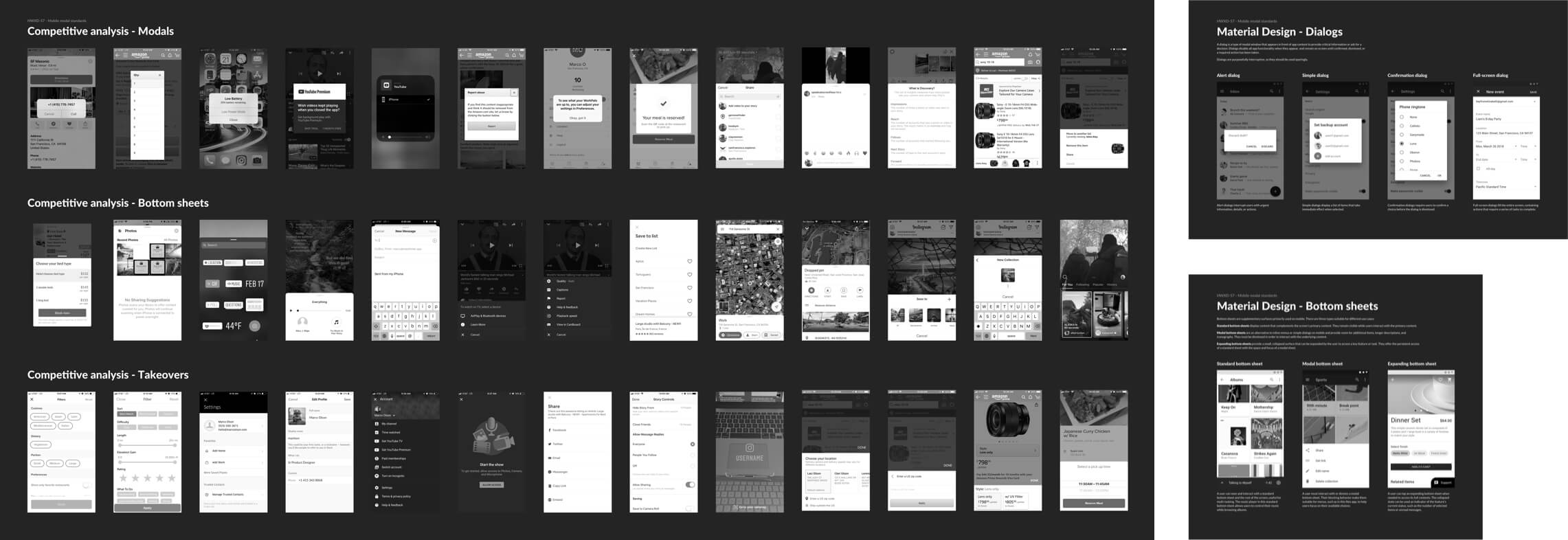
A product wide teardown was performed in order to get a clear picture of where we’re using different types of modal messaging patterns.

Who else uses modals? What types of interactions are associated with modals? Although I was able to find several examples, there was no clear industry standard in terms of closing patterns or interaction guardrails.
Based on our existing messaging patterns, and patterns being used in the competitive landscape, 4 types of modals were identified.
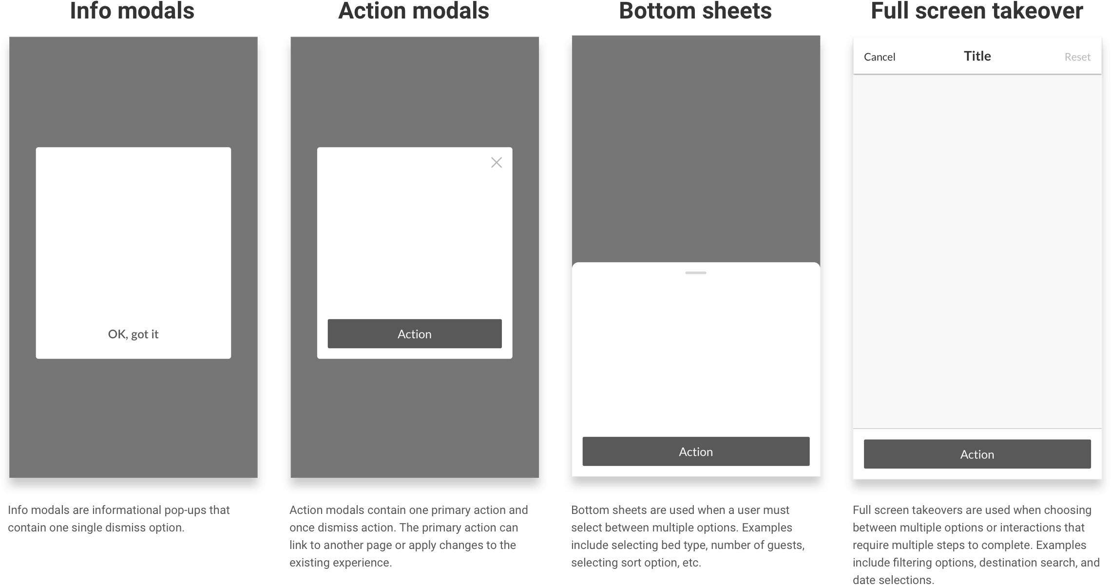
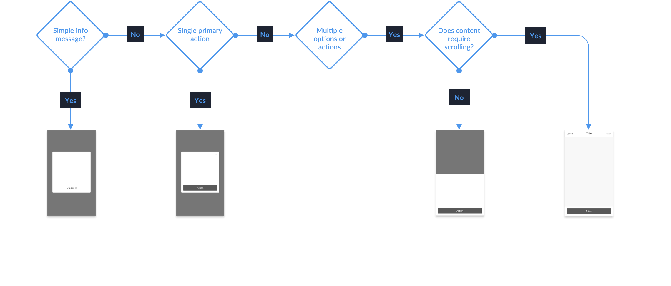
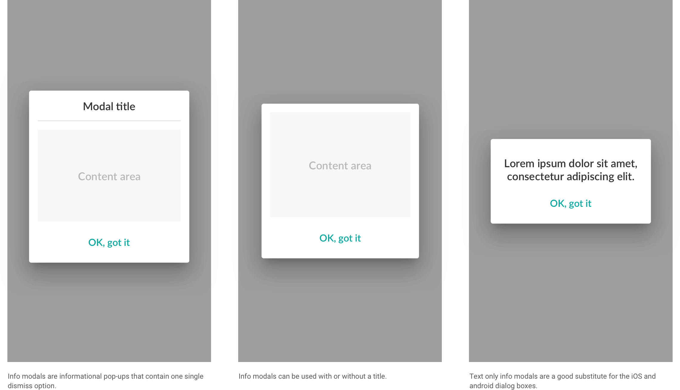
Info modals are informational pop-ups that contain one single dismiss option.
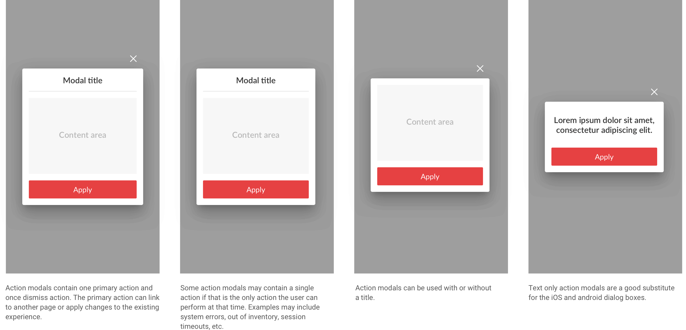
Action modals contain one primary action and once dismiss action. The primary action can link to another page or apply changes to the existing experience.
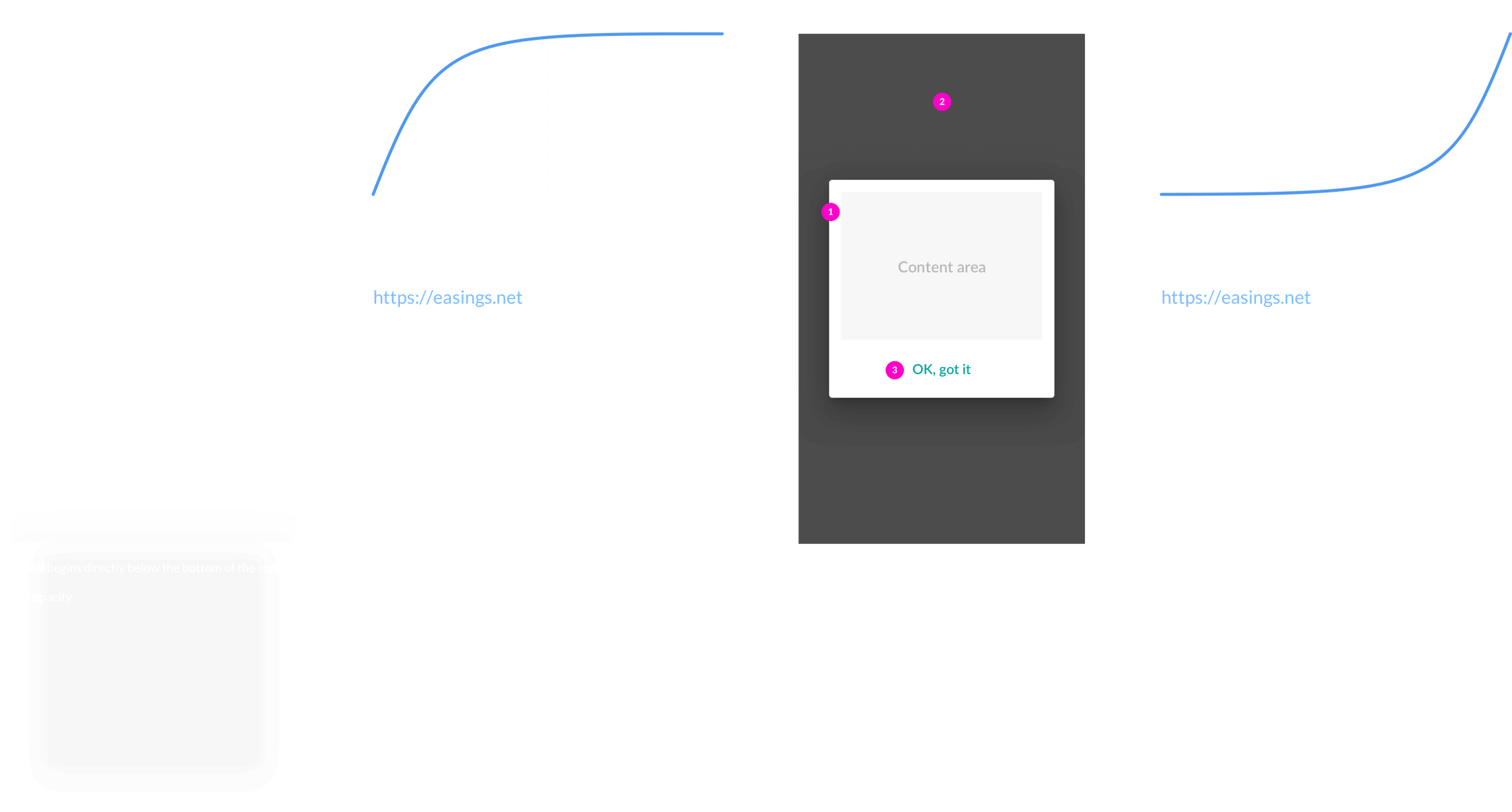
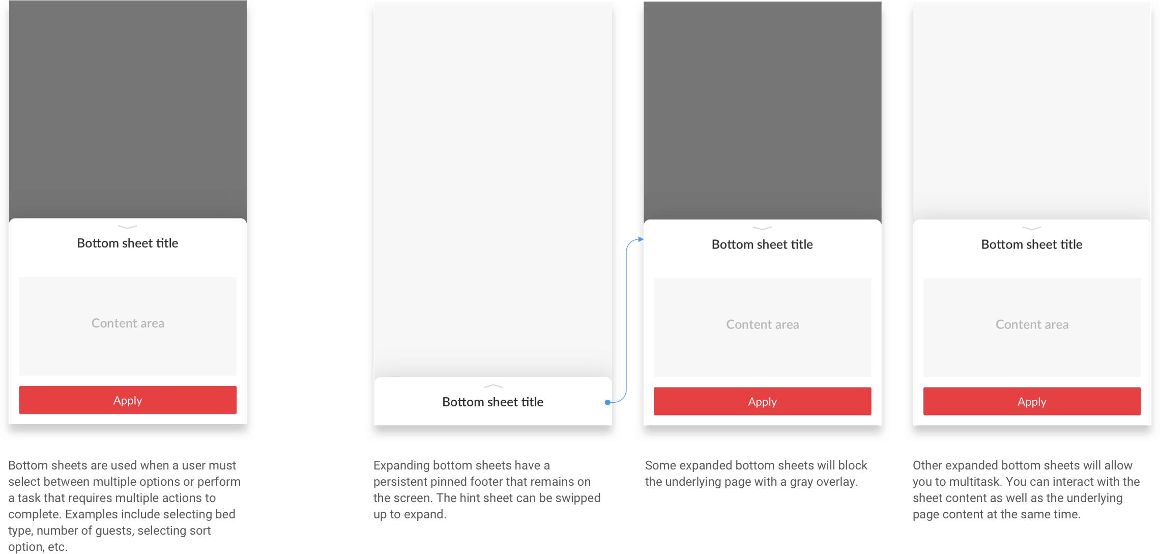
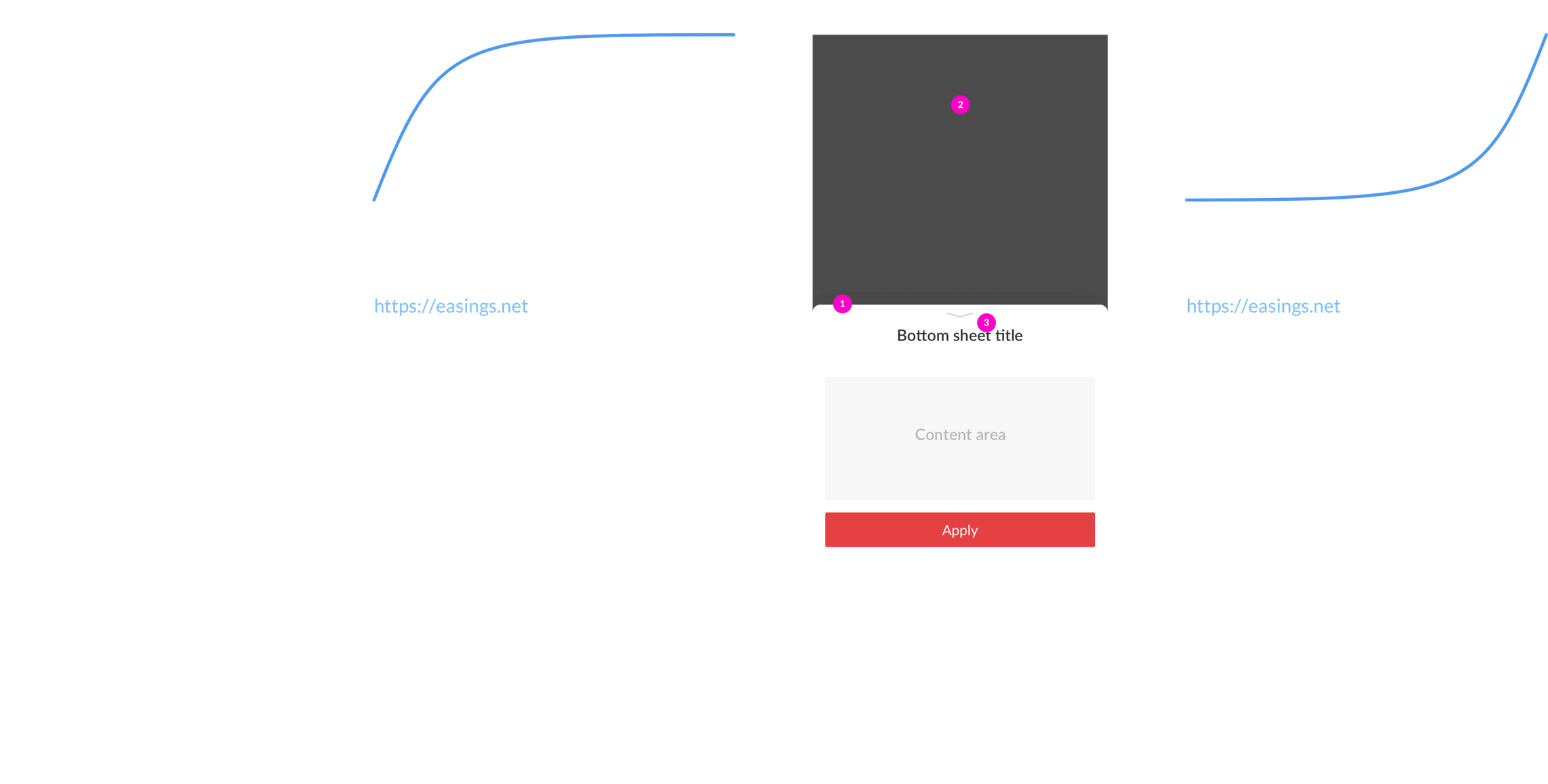
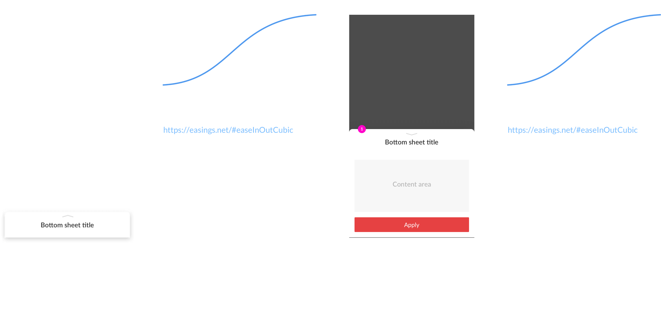
We conducted a usability test to determine whether users understood how to dismiss a bottom sheet. Many existing design patterns simply displayed a bar icon at the top of the sheet, but I wanted to confirm that the bar was indicator enough to swipe down.

Based on the feedback we received from 16 different test subjects, the following design recommendations were made.

Bottom sheets are used when a user must select between multiple options. Examples include selecting bed type, number of guests, selecting sort option, etc.
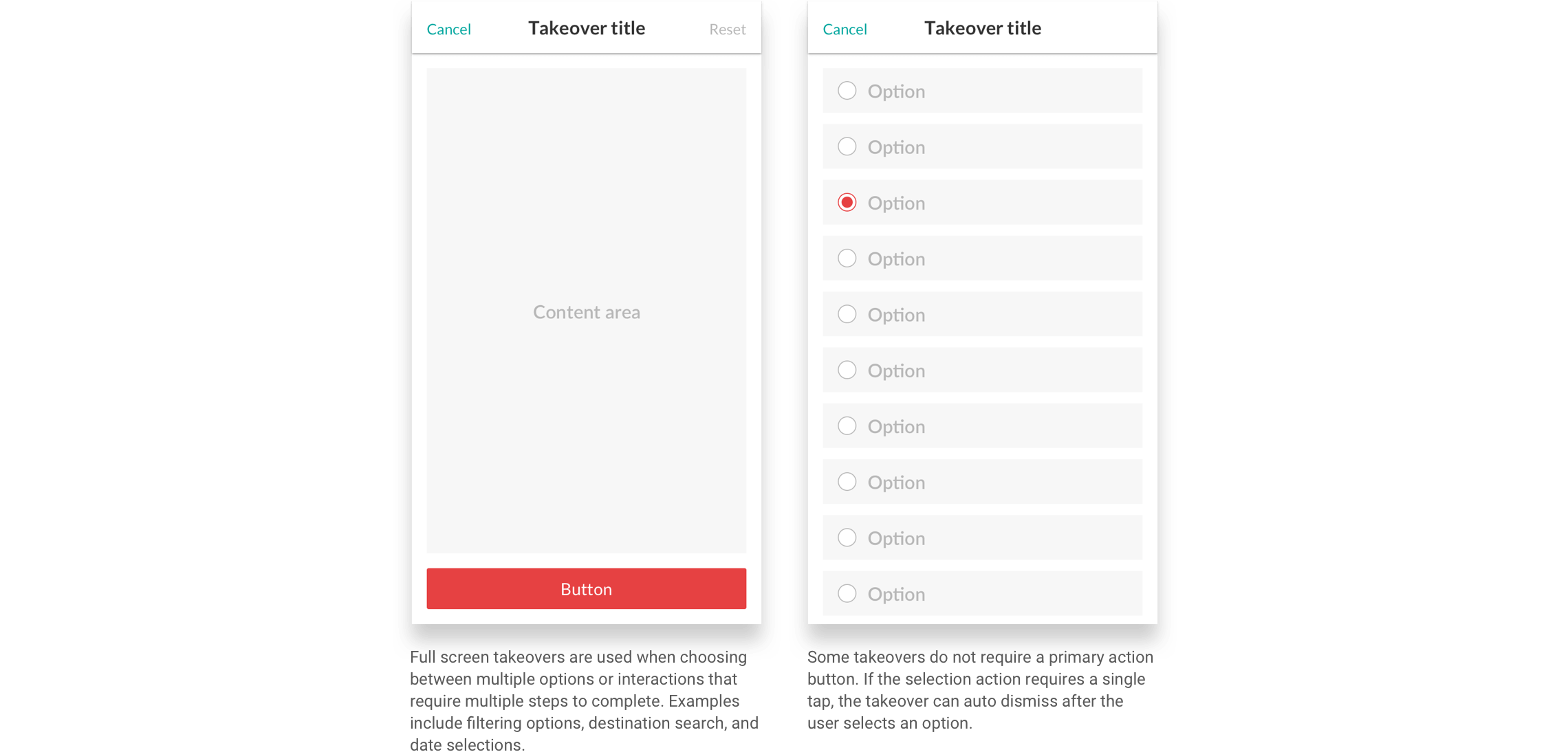
Full screen takeovers are used when choosing between multiple options or interactions that require multiple steps to complete. Examples include filtering options, destination search, and date selections.
